品牌 康康之家(广东·广州)
行业 康养,养老,保健
服务 品牌定位/vi升级设计/海报设计
北斗设计深耕中国市场,为客户提供策略+创意设计等多维度设计服务。
项目背景:
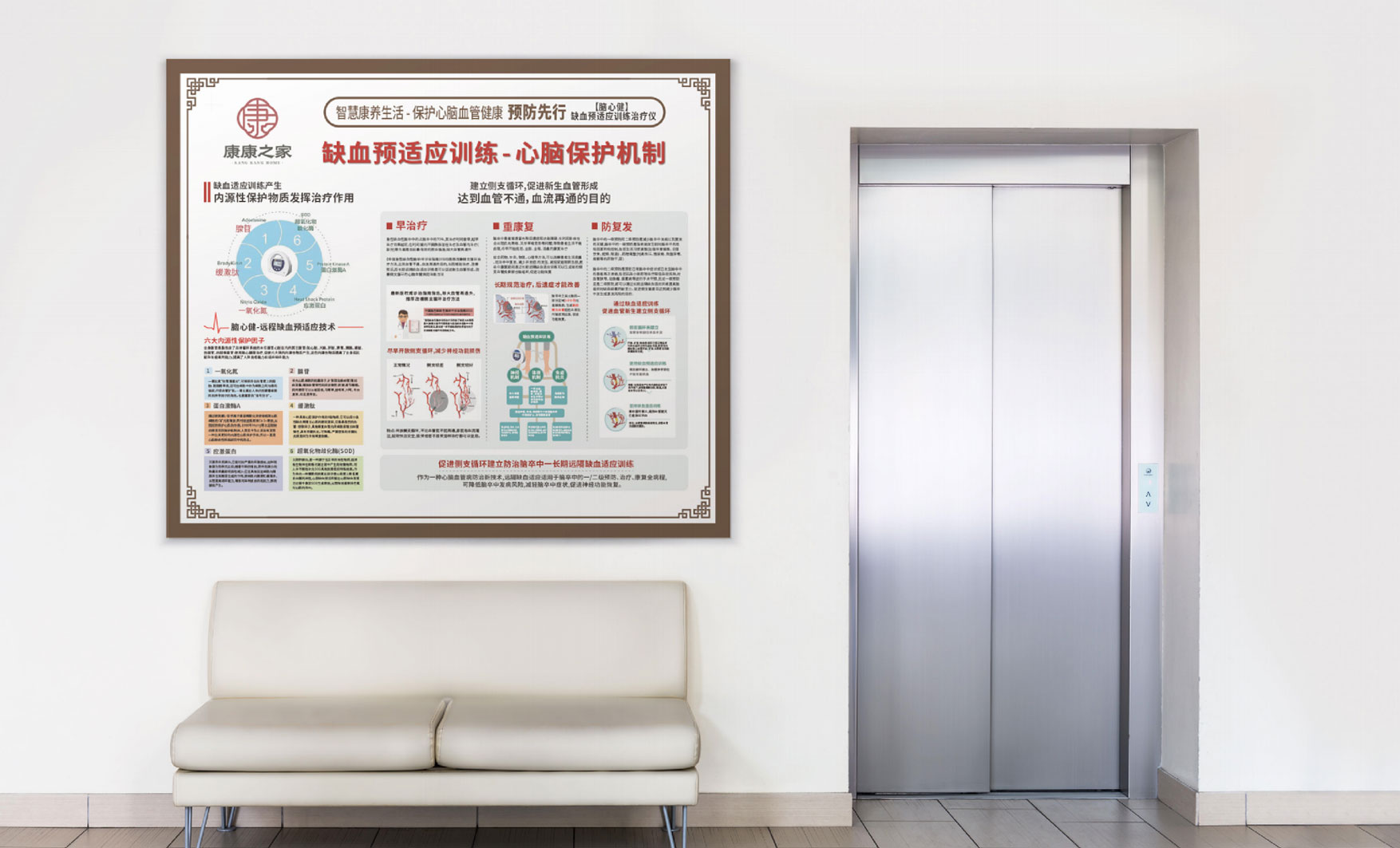
品牌创意的目的是为了更清晰地传播品牌的战略定位,通过创意能够让消费者感知到品牌文化的价值感,康康之家的定位是“智慧养老生活”,期待为每一个家庭提供智慧养老服务,这里有温馨的服务,有先进的仪器,有科学的方法和权威院士为您提供专业的服务。我们如何通过创意的传播让消费者记住我们是谁?我们的记忆符号是什么?
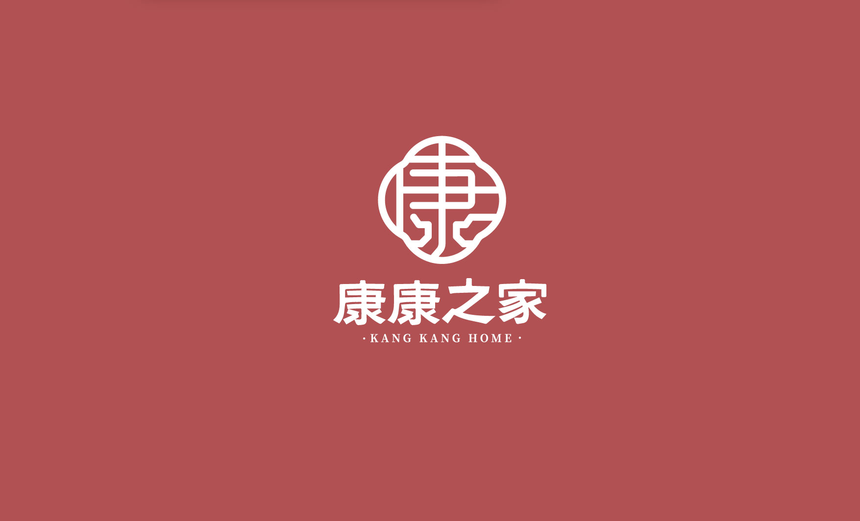
首先解决康康之家的品牌认知符号
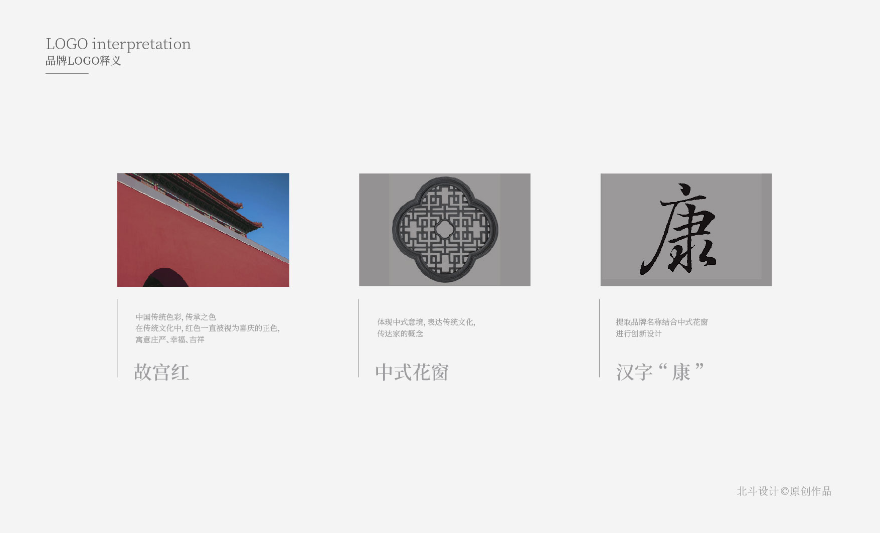
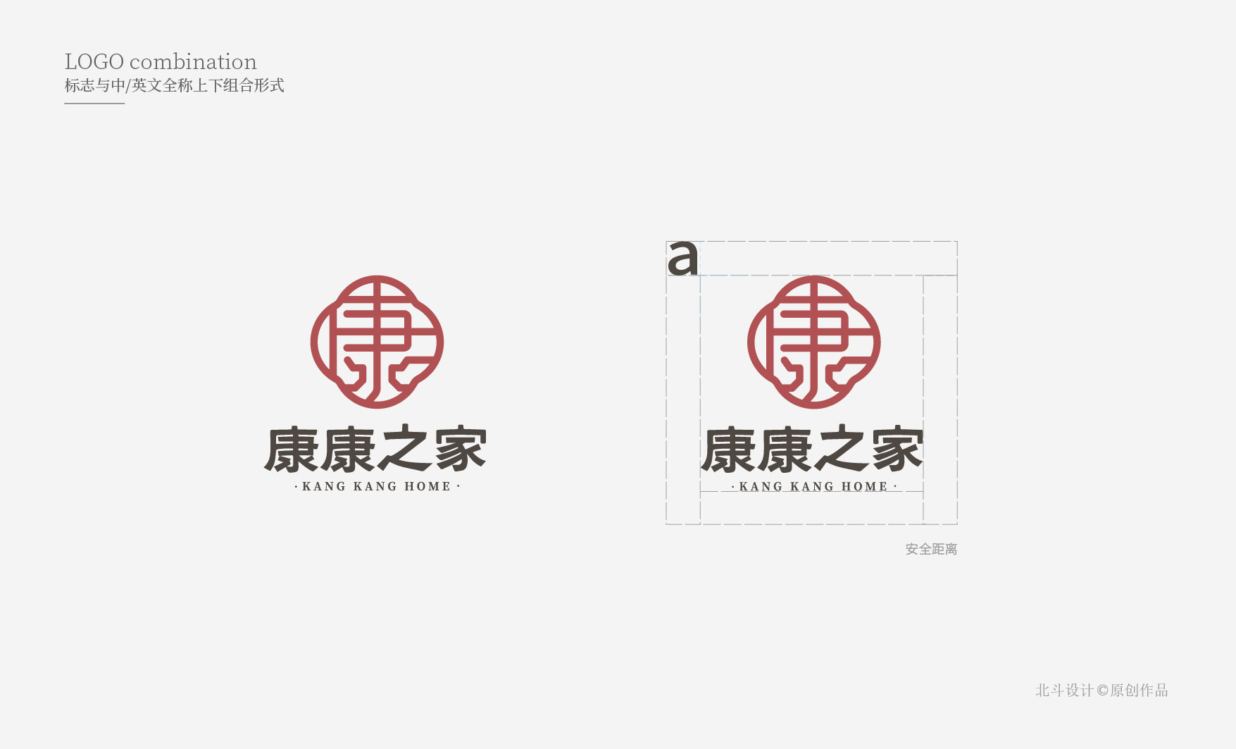
通过深度解析康康之家的定位及传播逻辑后,我们决定用“康”字作为品牌的视觉符号元素。原因有二:第一从品牌名字种提取品牌记忆符号,能够第一时间刺激品牌关联记忆,减少认知成本。第二,“康”字能够代表康康之家的核心战略。康养的目的是为了健康,健康是一切幸福的源泉,所以提取“康”作为品牌的战略符号设计非常契合品牌的诉求。
logo符号结合中式窗花
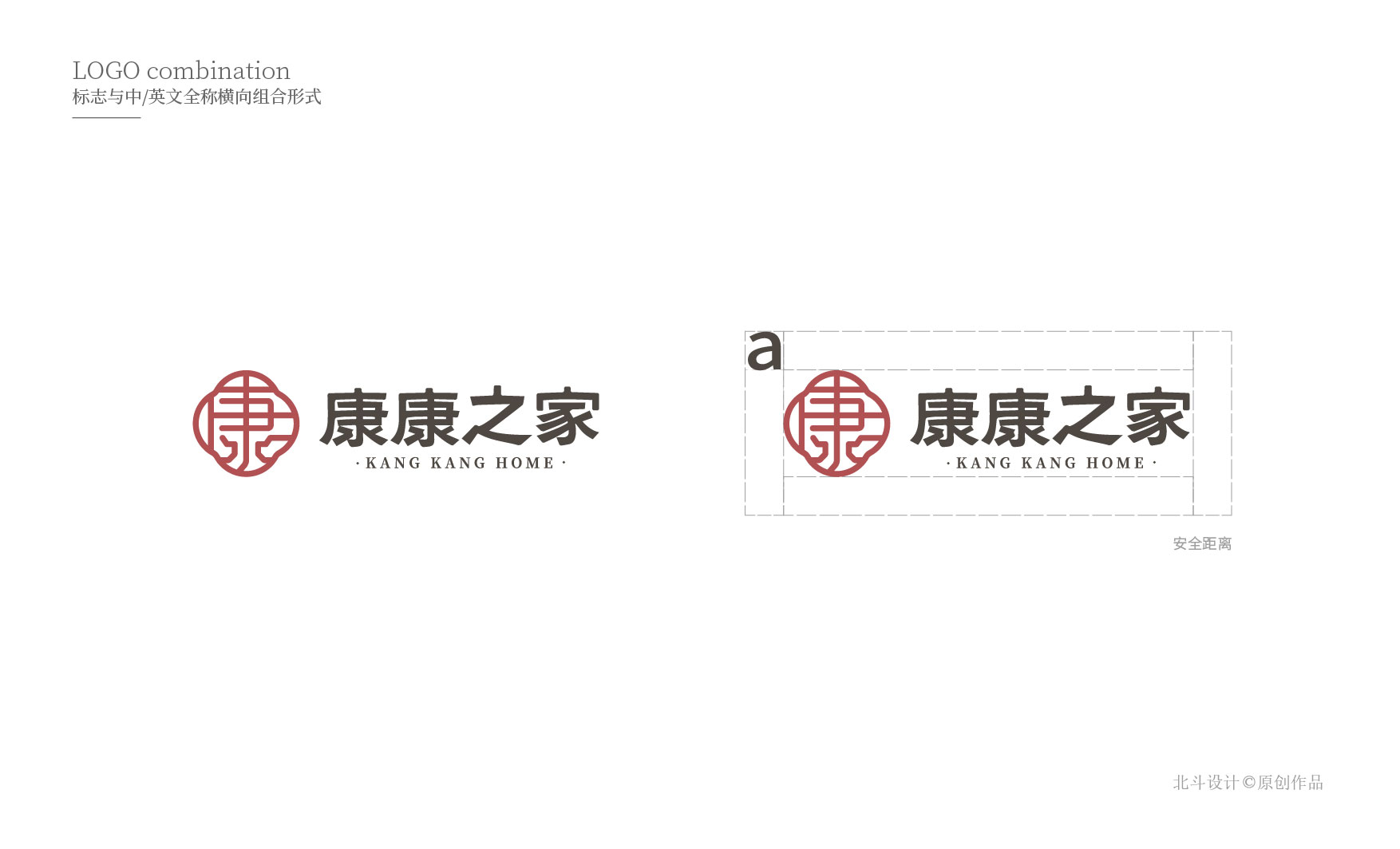
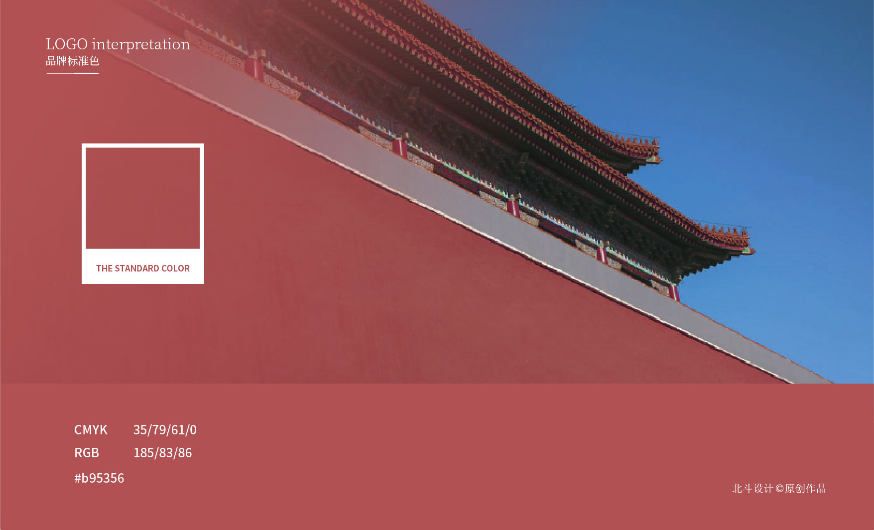
“康”字造型结合中式传统窗花造型,塑造中式的视觉风格,这也是北斗设计通过和客户探讨及品牌的定位来确定的“新中式”风格。为了更能呼应品牌的设计风格,康康之家的主色调为“故宫红”。字体的设计风格也是结合窗花的形态来表现,整个品牌logo形象给人一种非常沉稳且富有内涵的视觉感受。
Shaping the brand image of Kangkang House in multiple dimensions, from the strategic memory symbol of the brand, to the brand's vi image design, to the poster creative design of the exhibition hall
The purpose of brand creativity is to spread the brand's strategic positioning more clearly. Through creativity, consumers can perceive the value of brand culture. Kangkangzhijia's positioning is "smart elderly care life", and we look forward to providing smart elderly care services for every family. , There are warm services, advanced instruments, scientific methods and authoritative academicians to provide you with professional services. How do we make consumers remember who we are through the spread of ideas? What are our mnemonics?
First solve the brand recognition symbol of Kangkang House
After in-depth analysis of the positioning and communication logic of Kangkang House, we decided to use the word "Kang" as the visual symbol element of the brand. There are two reasons: First, extract brand memory symbols from brand names, which can stimulate brand-related memories for the first time and reduce cognitive costs. Second, the word "Kang" can represent the core strategy of Kangkang House. The purpose of health care is to be healthy, and health is the source of all happiness, so extracting "Kang" as a brand's strategic symbol design fits the brand's demands very well.
Logo symbol combined with Chinese window grilles
The shape of "Kang" is combined with traditional Chinese window grilles to create a Chinese visual style. This is also the "new Chinese" style determined by Beidou Design through discussions with customers and brand positioning. In order to better echo the brand's design style, the main color of Kangkang House is "Forbidden City Red". The font design style is also combined with the form of window grilles. The entire brand logo image gives people a very calm and connotative visual experience.